Everywhere an Isle
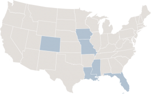
 Founded by the “father of riverboat gaming,” Isle of Capri was a mid-sized regional gaming company with operations in seven states across the United States and in the UK. The customer experience was as diverse as the geography. The company was built on a thematic Caribbean look and feel that was hugely popular at the time it was launched. With an aged theme in place at most locations, the 2007 introduction of the company’s fourth brand, “the isle.” was expected to give the company a fresh new brand identity, but there was confusion between the legacy Isle of Capri and the new “the isle.”, particularly since the community vernacular was to refer to the Isle of Capri as “the Isle,” and in the UK the company was an unknown. Additionally, there was concern that the fun communicated through their advertising was perhaps not matching the experience.
Looking to Another Challenger Brand
Retail giant Target is often credited with reinventing American retailing by winning the hearts and wallets of middle America. In 2008, Target’s senior management (like many other teams) watched their business decay as the economy slowed and American’s curbed their shopping. In 2009, same-store sales started declining, first 3%…then 5%…then 10% and the investment community started questioning the team and the company’s structure. However, Target’s executives realized the change was in the consumer behavior and not necessarily the product.
Isle’s senior management team faced a similar dilemma. They too knew the fundamental problem was not an issue with the product, but with the shrinking availability of leisure dollars.
Target’s response was identifying the needs of their shopper persona…their “lady”…and quickly developed a prototype grocery operation for their stores that was designed to drive traffic, highlighting points of differentiation even in the face of a seemingly “me too strategy” (as Walmart had already launched a similar offering). Target was ultimately able to increase traffic and same-store sales as a result of changing their marketing messaging to reflect the reality of the new economy and offering a better customer experience.
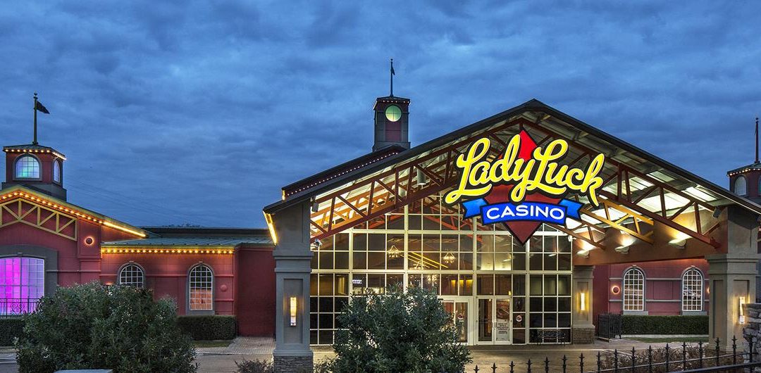
Isle also had a “Lady” of their own in mind and believed they could enhance the customer experience and reinvigorate regional gaming by the reintroduction of the iconic Lady Luck brand as well as fine-tuning its foundational Isle brand.
More Than a New Sign and Logo
The Isle team understood the importance of such an icon as Lady Luck. They knew that she deserved more than a new logo. She deserved a transformation of the experience and that each experience needed to deliver on the promise of “fun, friendly and FANtastic value.”
Looking again at best practices outside of the industry, the team saw similarities to the Southwest Airlines model – a low-cost provider of great experiences with a focus on customer service, friendly employees and value. At the start of the economic crisis, Southwest looked at the competitive landscape and made a strategic decision to launch initiatives that would create more value in the mind of the budget-conscious traveler. Unlike their competitors, Southwest chose not to charge hidden fees and to focus on service upgrades such as Business Select and priority security access screening lanes to drive incremental revenue. Southwest is one of the few airline carriers that emerged relatively unscathed through the “Great Recession,” remaining largely profitable in an industry hard hit by the pressure on the economy.
Operationalization of the Brand
Seeing the thought processes and similarities in Target and Southwest solidified the Isle’s vision that the revival of the Lady Luck was the right move. When launched in Caruthersville, MO the brand embodied clearly defined expectations for guests, employees, and investors – an experience focused on value and fun. Fun was always at the core of the company’s ethos. The environment was created to be rich with touchpoints including two new food and beverage offerings, Otis and Henry’s (casual dining) and the Lone Wolf Bar (where the beer is always cold, and the wings are hot). Both were designed to support the Lady Luck positioning of value, as well as comfort, and both were an immediate success with guests (see video). Additionally, the well-operationalized brand allowed the company to realize a pipeline for both internal grown and future acquisitions. Employees fell in love with their Lady, often designing creative ways to bring her to life continuously.
Lady Luck was the right brand at the right time. More importantly, the rebranding was strongly rooted in the operator’s strategy to match the experience to the customer expectation. Moreover, the brand was fully operationalized to create a new business model with a pipeline of growth for the company.


Recent Comments